
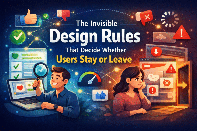
When users land on a website or open an app, they make a decision far faster than they realize. Within seconds—often milliseconds—they subconsciously decide whether to stay, explore, or leave. This decision isn’t driven by flashy visuals or clever slogans alone. It’s guided by a set of invisible design rules rooted in UX (User Experience). These rules are rarely noticed when done right, but painfully obvious when ignored.
UX is not just about how something looks; it’s about how it feels to use. From navigation flow to micro-interactions, every design choice influences trust, clarity, and comfort. In this article, we’ll uncover the unseen UX principles that quietly shape user behavior and determine whether your digital product earns loyalty or loses attention.
Table of Contents
ToggleWhy UX Is the Silent Deal-Breaker
Users don’t consciously analyze UX—they experience it. When an interface feels intuitive, users move forward without friction. When it doesn’t, frustration builds, and exits happen silently.
Poor UX doesn’t always look “bad.” Sometimes it looks polished but behaves confusingly. Buttons may be visible but unclear. Content may be well-written but hard to scan. Pages may load, but too slowly to maintain attention. This is where understanding the Best user experience basics becomes essential—because usability starts with language as much as layout.
Good UX works in the background. It anticipates user needs, removes doubt, and makes actions feel effortless. This is why understanding the invisible rules of UX is essential for retention, engagement, and conversions.
Rule 1: Clarity Always Beats Creativity
Creativity has its place, but clarity wins every time in UX. Users don’t want to think—they want to understand instantly.
Clear UX answers three questions without effort:
- Where am I?
- What can I do here?
- What should I do next?
Overly clever layouts, unconventional navigation, or vague labels might look unique, but they increase cognitive load. If users have to pause to interpret an interface, you’ve already lost momentum.
Actionable tip:
Use familiar patterns for navigation, buttons, and page structure. Innovation should enhance usability, not replace it.
Rule 2: Visual Hierarchy Guides Behavior
Users don’t read screens—they scan them. Visual hierarchy determines what they notice first, second, and third.
Effective UX uses:
- Size to signal importance
- Color to draw attention
- Spacing to group related elements
- Contrast to separate primary actions from secondary ones
Without a strong hierarchy, users feel overwhelmed. Everything competes for attention, and nothing stands out.
Actionable tip:
Design each page with one primary goal. Make that goal visually dominant and remove distractions that don’t support it.
Rule 3: Consistency Builds Trust
Consistency is one of the most overlooked UX principles. When elements behave differently across pages—buttons change style, icons mean different things, or layouts shift unexpectedly—users feel uncertain.
Consistency reduces learning effort. Once users understand how something works, they expect it to work the same way everywhere.
This applies to:
- Navigation placement
- Button styles
- Typography
- Tone of language
Trust is built through predictability.
Actionable tip:
Create and follow a design system. Even small projects benefit from consistent rules for colors, spacing, and components.
Rule 4: Speed Is Part of the Experience
Performance is UX. A beautiful interface that loads slowly is still a bad experience.
Users associate speed with quality and professionalism. Delays—even short ones—create friction and impatience. This is especially critical on mobile devices, where attention spans are shorter.
UX-friendly performance includes:
- Fast page load times
- Smooth transitions
- Immediate feedback after actions
Actionable tip:
Optimize images, reduce unnecessary scripts, and prioritize perceived speed by showing progress indicators or skeleton screens.
Rule 5: Feedback Reassures Users
Every action needs a response. When users click, tap, submit, or scroll, they expect feedback that confirms something happened.
Lack of feedback creates doubt:
- Did my form submit?
- Was my click registered?
- Is the system working?
Subtle UX feedback includes hover states, loading animations, success messages, and error prompts that explain what went wrong.
Actionable tip:
Design micro-interactions intentionally. Small visual cues can dramatically improve user confidence and satisfaction.
Rule 6: Content Is a UX Element, Not Decoration
Words are part of the interface. Poorly written content can break UX just as quickly as poor design.
Effective UX content is:
- Clear, not clever
- Helpful, not promotional
- Concise, not vague
Labels, instructions, error messages, and CTAs all shape the user journey. Even a single confusing sentence can stop progress.
Actionable tip:
Write copy that answers user questions at each step. Use simple language and avoid internal jargon.
Rule 7: Reduce Cognitive Load at Every Step
Cognitive load refers to the mental effort required to use an interface. The higher the load, the faster users fatigue and abandon tasks.
Common UX mistakes that increase cognitive load include:
- Too many choices at once
- Long forms without guidance
- Dense paragraphs with no scannability
- Unclear next steps
Good UX simplifies decisions and breaks complex actions into manageable steps.
Actionable tip:
Apply the principle of progressive disclosure—show only what users need at the moment, and reveal more as they move forward.
Rule 8: Design for Real Users, Not Assumptions
UX fails when it’s based on assumptions instead of behavior. What designers think users want often differs from what users actually do.
Real UX improvement comes from:
- Observing user behavior
- Analyzing drop-off points
- Testing navigation and flows
- Listening to user feedback
Even small usability testing sessions can uncover invisible friction points.
Actionable tip:
Test early and often. You don’t need large budgets—simple usability tests can reveal powerful insights.
Rule 9: Accessibility Is Not Optional
Accessible UX benefits everyone, not just users with disabilities. Clear contrast, readable fonts, keyboard navigation, and logical structure improve usability across the board.
Ignoring accessibility limits your audience and harms overall experience quality.
Actionable tip:
Follow basic accessibility guidelines such as proper heading structure, sufficient color contrast, and readable font sizes.
Why These Invisible Rules Matter More Than Ever
In a competitive digital landscape, users have endless alternatives. They won’t complain when UX fails—they’ll just leave.
What makes UX powerful is its invisibility. When done right, users don’t notice it at all. They simply feel comfortable, confident, and in control. When done wrong, even the best content or strongest marketing can’t save the experience.
By focusing on clarity, consistency, speed, feedback, and user-centered thinking, you create digital experiences that don’t just attract users—but keep them.
Final Thoughts
UX isn’t about trends or aesthetics alone. It’s about understanding human behavior and designing with empathy. The invisible design rules discussed here quietly shape every user decision, influencing whether someone stays, explores, converts, or disappears forever.
Mastering UX means respecting users’ time, attention, and expectations. When you do, the results speak for themselves—not through loud design, but through seamless experiences users actually enjoy using.